Proposed Rebrand Guidelines
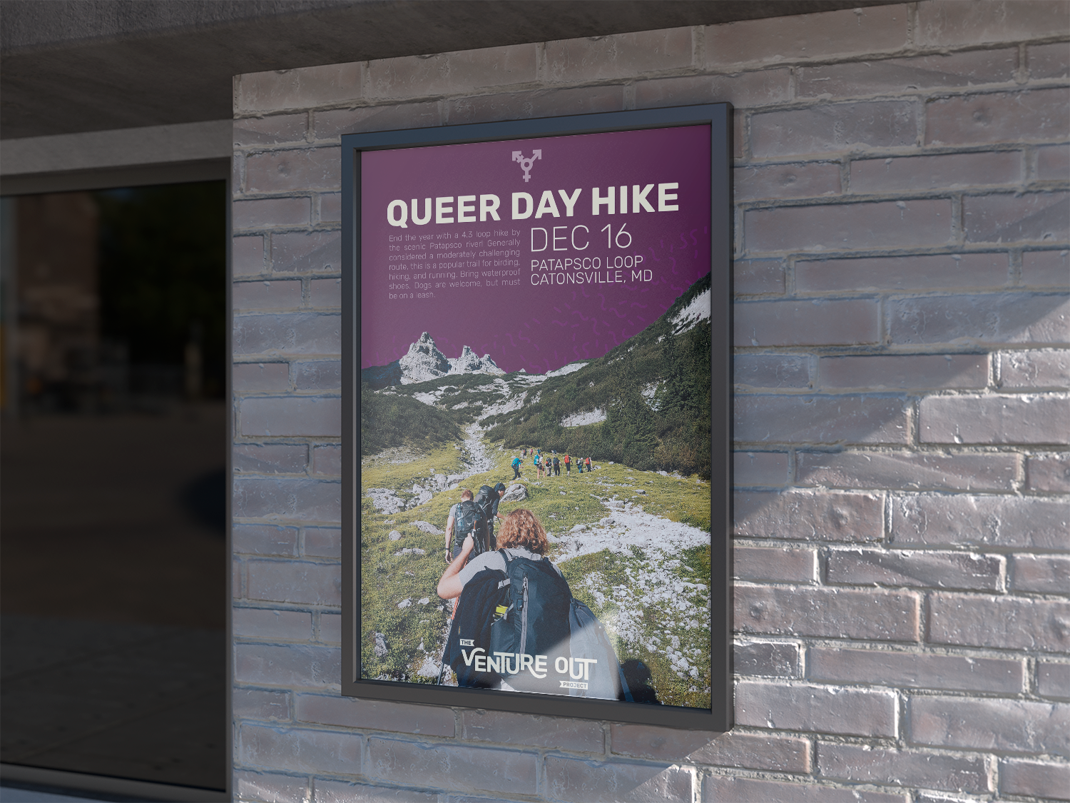
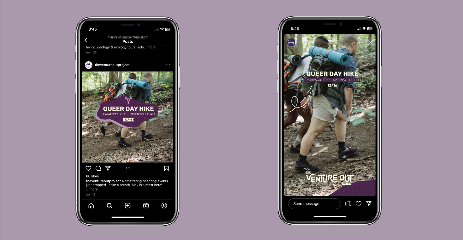
Poster advertising a local hike presented by the Venture Out Project.
For this personal project, I wanted The Venture Out Project’s logo and brand imagery to reflect their involvement with outdoor market while maintaining their LGBTQ+ positive brand identity. I kept purple in the color palette and made it the central color of the brand identity, standing out against the normal green and blue hues of outdoor brands. I added supporting colors of green, off-white, and orange to incorporate the outdoors into the brand, and used imagery and wording within the brand booklet and other deliverables that reinforced the ideals of LGBTQ+ safety, celebration, and inclusion.
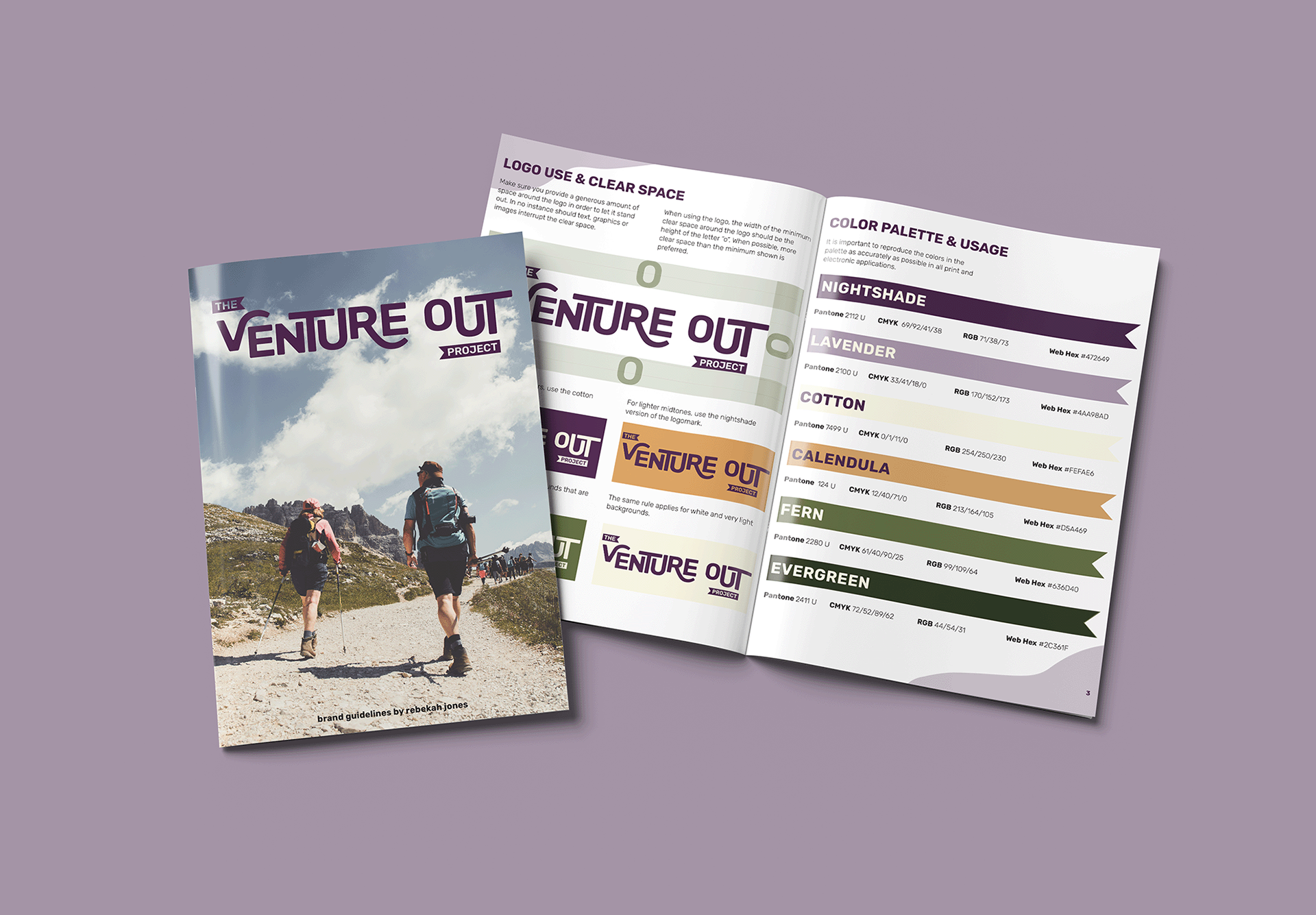
Front cover and opening spread (Logo Use & Clear Space, Color Palette) of the brand guidelines booklet.
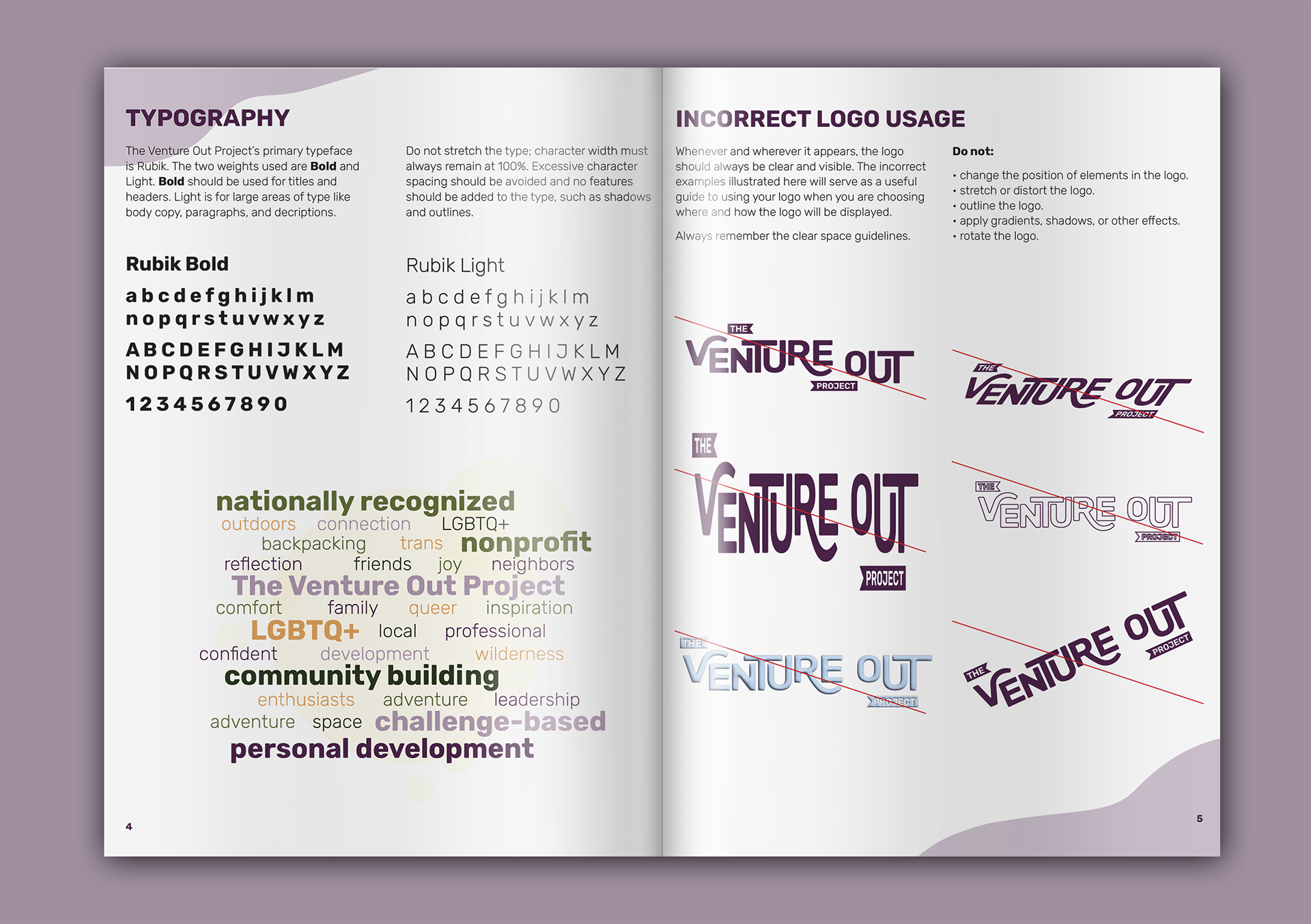
Type + Logo Usage rules.
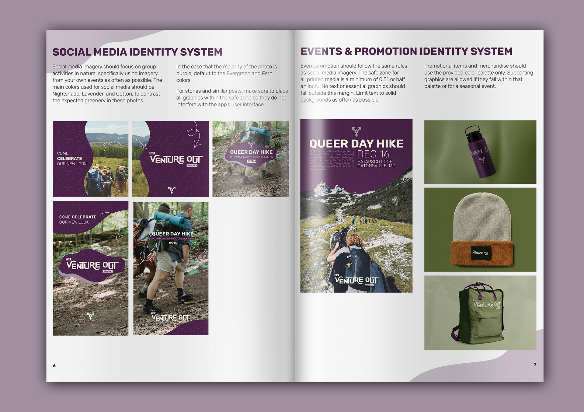
Social Media & Promotional Materials rules.
I chose an approachable sans serif font for the logo and the entire brand, customizing the typeface of the logo to be reminiscent of the mountains and rivers that TVOP leads people through. Social media and print collateral have large color blocks of purple that contrast against the nature-focused photography that would be common within the brand, drawing attention to the text within.